CV-Coach case study
Here’s a good example of Conversion Rate Optimization of a specific landing page of one of our clients. CV-Coach.com are professional writing experts of CVs but their registration landing page showed a high bounce rate. It was time to optimize.
Your page sucks!
When we analyzed the landing page and the user behavior these were the most important things we discovered:
- Within the first 3 seconds the page didn’t answer these questions “Why should I use such a service at all?” and “Why here?”
- Users could not identify CV-Coach´s main messages (USPs).
- The heatmap showed that the attention fields after the orientation phase of 2-3 seconds were not consistent: the logo caught too much attention, whereas the Headline, the text which is supposed to convince the users and the CTA (Call-to-Action button) received too little.
- There were no trust elements visible and the few arguments (below the fold) received no attention at all.
- They were offering too many options to click and thus confusing the user.
- The 4 steps process on the bottom was not above the fold (600 pixels), so was not visible in most of the screens.
Eyetracking-analysis of CV-Coach`s Landing Page:
![]()
![]()
This was the original design of CV-Coach registration landing page:
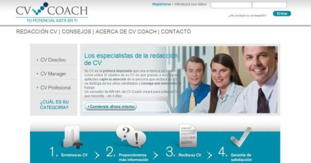
Help your users
All these points had to be fixed. What we did first was to identify their most common profile of user and we tried to solve the initial questions in a quick overview: Why should they use our service? Why here?
We decided to remove those elements that were not necessary on this first phase and to remark the USPs of our customer, so we applied the following changes:
- We replaced the title by stating their most powerful advantage: users will get more job interviews using their service.
- We also summarized all their text with 5 check-marks with some other arguments that answered the question “Why here?”. These arguments were reinforced by the bottom boxes.
- The navigation column on the left was removed as their statistics showed that there was nothing relevant for the user there.
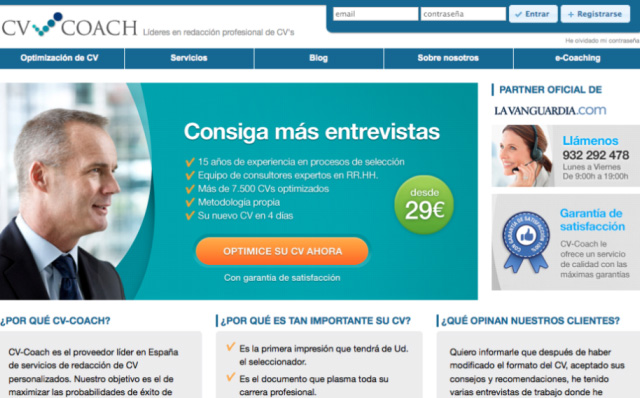
In the second step Conversion Rockers tried to find the right balance of colours and contrasts. We needed a strong contrast between the “call to action” button and the rest of the website.
- We replaced the background colour of the USP messages.
- Including the CTA in an orange colour provided them with the big contrast that we were looking for.
- We tried with another image in which a business man was looking at the CTA direction to make it more powerful.
All these elements were tested through eye-tracking tools until we found the perfect combination to prioritize the most important elements in the user buying process.
Make your website credible
Finally we needed to make the message more convincing and credible, so we worked with the tried and tested processes:
- They collaborated with a well-known newspaper portal, so we decided to mention their partnership including their logo.
- We also implemented an ecommerce trust batch of a service which was renowned
- Phone support fields function as a trust element, so we decided to make it visible as we detected that lots of users were looking for extra information during their navigation. We included a friendly, smiling elderly lady with glasses and a headset.
- A testimonials box was also included with the opinion of real customers.
And the winner is…
The final version with some of the most important changes that were proposed to CV-Coach looked like this:
As a result they get +424% more sales in the A/B tests between the original version and the optimized one, so there was a clear winner!